The project was a re-imagining of how people worked at Pythian and how they shared their progress with clients. This meant introducing new tooling to increase productivity and improve customer engagement.
PythOS Project
Research Methods
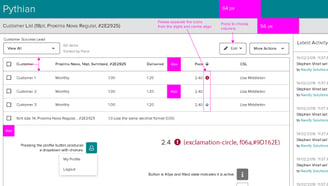
Since this project was being built from the ground up, time was devoted to identify key stakeholders and determine objectives. This meant interviews with all levels of the organisation and in time, the picture became clearer in regards to areas we could deliver value early in development.
Quick mock-ups and drafts were created to capture feedback and gain alignment. As the research progressed, we increased our level of confidence to define a plan and deliver value iteratively.

Insights
We identified certain outcomes that would deliver high value early on in the development. For starters, we identified jobs that were better handled by third party tools. These integrations allowed us to offload problems that were solved by other industry experts and leverage them in a meaningful way that was unique to Pythian. From a UX standpoint, this decision guided the design of the tool.
Our research also highlighted value in providing customers up-to-the-minute updates on work delivered towards their contracts, alerts tied to those contracts, and interestingly, an opportunity for responsive design for a range of personas likely to access the portal from their phones.
Ideation
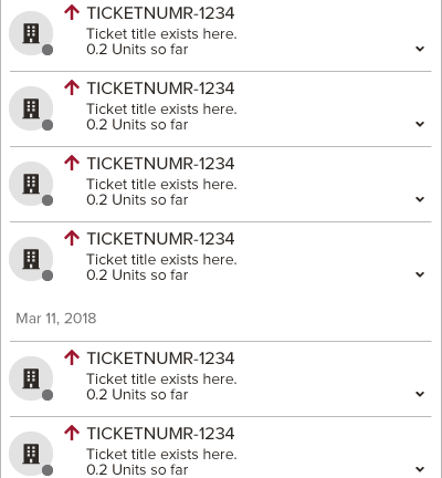
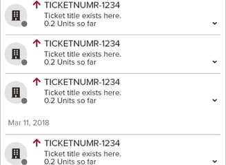
Insights, designs, and feedback were collected forming a good foundation to establish design guidelines and a general UX paradigm. This included information architecture as well as component design for reusable elements like tables, iconography, date picker, buttons, and many more.
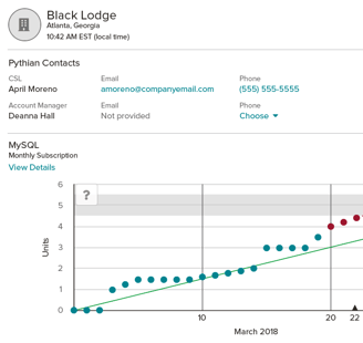
The responsive site approach meant identifying breakpoints and how to present the tool on various screen sizes. We were including graphs and tables so we devoted part of our research to identifying some sense of data prioritisation in our UI.
Integrating with third party tools also meant design dependencies. In some cases, this meant we were limited on the level of information we could surface in our own UI but in other situations, the restrictions were specific to usability. For example, interactions had to accommodate the human touch, not just clicks of a mouse. Our chosen chart library and date picker were components that required more usability testing than others.

Measurement
The project was initially rolled out to a subset of internal users as a BETA program. This gave us an opportunity to learn and iterate on feedback.
We also monitored usage patterns via various tracking tools to capture quantitative and qualitative data. Initial research helped increase our understanding of the use cases, personas, and user journeys but once the tool went to production, we were excited to capture new insights. A notable takeaway included user flows and certain paths to information that validated our initial designs but also indicated opportunities to refine specific areas. Discovery is continuous.
UX Outcomes
For the internal users, change was hard. Moving from a legacy system that had been around for years to a new product took time and patience. Through frequent user touchpoints and iterative development, the product would grow with their adoption.
Adoption among customers enjoyed steady and widespread growth. This was a new means for them to learn about project progress. Customer stakeholders were now able to login at any point to catch the latest updates. We celebrated visits from new customers, the first mobile login, and as previously noted, the growing adoption rates.
